
The Local Insights Widget combines demographic highlights, selected local data cards, and an area-report call to action in one listing-friendly component.
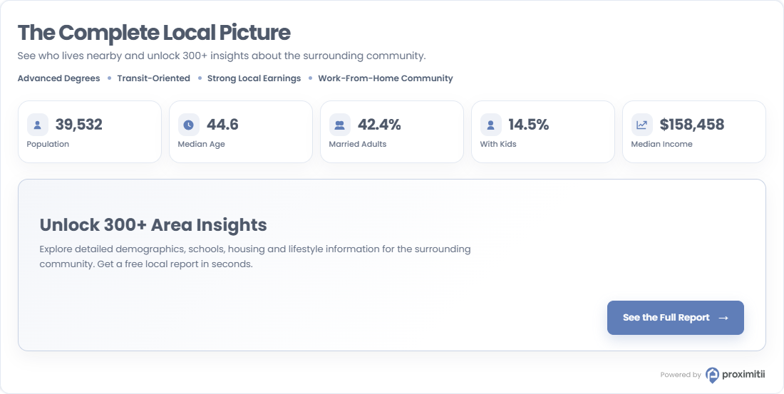
Installation
Add the following embed code to your page or template. Replace the widget key and coordinates with your own values.
<div id="prox-local-insights"></div>

<script src="https://widget.proximitii.com/v1/core/proximitii-widget.js?v=35"></script>

<script>
ProximitiiWidgets.localInsights({
  container: 'prox-local-insights',
  widgetKey: "PUT_YOUR_WIDGET_KEY_HERE",
  lat: 40.778832684988224,
  lon: -73.98103168840414
});
</script>
Always provide a valid widgetKey, lat, and lon. All other settings are optional and fall back to the defaults listed below.
Customization
The following Local Insights Widget customization options are available.
General and Content Options:
| Name | Description | Default Value | Accepted Values | Variable / Function |
|---|---|---|---|---|
| Container | The ID of the div where the widget renders. | N/A | Any valid element ID | container |
| Widget Key | Your public widget key. | N/A | Valid Proximitii widget key | widgetKey |
| Latitude | Sets the latitude of the center location. | N/A | Decimal between -90 and 90 | lat |
| Longitude | Sets the longitude of the center location. | N/A | Decimal between -180 and 180 | lon |
| Radius | Sets the local data search radius. | 500 | Positive number of meters | radius |
| Country | Sets the country dataset. | us | us or ca | country |
| Language | Sets the widget language. | en | en or fr | language |
| Title | Sets the widget title. | The Complete Local Picture | Any valid text | title |
| Title Font Size | Sets the title font size. | 30px | CSS size | titleFontSize |
| Description | Sets the text shown below the title. The $radius token is replaced with the selected radius. | See who lives within a $radius radius and unlock 300+ local insights. | Any valid text | description |
| Show Highlights | Shows or hides the community-highlight row. | true | true/false | showHighlights |
| Show Data | Shows or hides the selected local data cards. | true | true/false | showData |
Appearance Options:
| Name | Description | Default Value | Accepted Values | Variable / Function |
|---|---|---|---|---|
| Show Border | Shows or hides the widget border. | true | true/false | showBorder |
| Primary Color | Sets the primary brand color. | #607eb8 | Hex color | primaryColor |
| Secondary Color | Sets the secondary panel/background color. | #f8fafc | Hex color | secondaryColor |
| Font Family | Sets the widget font family. | Poppins, sans-serif | Any valid CSS font-family | fontFamily |
| Box Style | Controls the widget container styling. | shadow | shadow or flat | boxStyle |
Data Card Options:
| Name | Description | Default Value | Accepted Values | Variable / Function |
|---|---|---|---|---|
| Data Cards | Selects the five demographic data cards shown in the widget. | population, medianAge, marriedAdults, withKids, medianIncome | Select exactly five: population, medianAge, marriedAdults, withKids, medianIncome, households, populationDensity, unemploymentRate, peoplePerHousehold, bachelorsDegree | cards |