
The Community Highlights Widget displays up to 10 community scorecards and configurable local highlights for a selected location and radius.
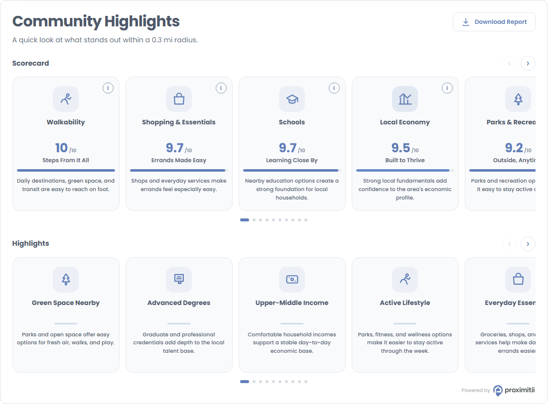
Installation
Add the following embed code to your page or template. Replace the widget key and coordinates with your own values.
<div id="prox-community-highlights"></div>

<script src="https://widget.proximitii.com/v1/core/proximitii-widget.js?v=34"></script>

<script>
ProximitiiWidgets.communityHighlights({
  container: 'prox-community-highlights',
  widgetKey: "PUT_YOUR_WIDGET_KEY_HERE",
  lat: 40.778832684988224,
  lon: -73.98103168840414
});
</script>
Always provide a valid widgetKey, lat, and lon. All other settings are optional and fall back to the defaults listed below.
Customization
The following Community Highlights Widget customization options are available.
General Options:
| Name | Description | Default Value | Accepted Values | Variable / Function |
|---|---|---|---|---|
| Container | The ID of the div where the widget renders. | N/A | Any valid element ID | container |
| Widget Key | Your public widget key. | N/A | Valid Proximitii widget key | widgetKey |
| Latitude | Sets the latitude of the center location. | N/A | Decimal between -90 and 90 | lat |
| Longitude | Sets the longitude of the center location. | N/A | Decimal between -180 and 180 | lon |
| Radius | Sets the local data search radius. | 500 | 100 to 6400 meters | radius |
| Country | Sets the country dataset. | us | us or ca | country |
| Language | Sets the widget language. | en | en or fr | language |
Content Options:
| Name | Description | Default Value | Accepted Values | Variable / Function |
|---|---|---|---|---|
| Title | Sets the widget title. | Community Highlights | Any valid text | title |
| Title Font Size | Sets the title font size. | 30px | CSS size | titleFontSize |
| Description | Sets the text shown below the title. The $radius token is replaced with the selected radius. | A quick look at what stands out within a $radius radius. | Any valid text | description |
| Layout Mode | Controls whether scorecards and highlights render in separate rows or a combined layout. | twoRows | twoRows or combined | layoutMode |
| Show Navigation | Shows or hides carousel navigation controls. | true | true/false | showNavigation |
| Show Download Report | Shows or hides the download report button. | true | true/false | showDownloadReport |
Scorecard Options:
| Name | Description | Default Value | Accepted Values | Variable / Function |
|---|---|---|---|---|
| Show Scorecard | Shows or hides the scorecard section. | true | true/false | showTopSection |
| Section Title | Sets the scorecard section title. Leave blank to hide it. | Scorecard | Any valid text | topTitle |
| Number of Cards | Sets the number of scorecards displayed. | 10 | 1 to 10 | topCardCount |
| Scorecard Selection | Controls which scorecards are displayed and their order. | All scorecards | walkability, shopping-essentials, transit-access, bike-access, schools, noise-level, local-economy, parks-recreation, neighbourhood-pace, community-feel | topSelectedCards |
| Order | Controls scorecard order. | highest | highest or custom | topOrder |
| Show Scores | Shows or hides numerical scores on scorecards. | true | true/false | topShowScores |
| Show Descriptions | Shows or hides scorecard descriptions. | true | true/false | topShowDescriptions |
Highlights Options:
| Name | Description | Default Value | Accepted Values | Variable / Function |
|---|---|---|---|---|
| Show Highlights | Shows or hides the highlights section. | true | true/false | showHighlightsSection |
| Section Title | Sets the highlights section title. Leave blank to hide it. | Highlights | Any valid text | highlightsTitle |
| Number of Cards | Sets the number of highlights displayed. | 10 | 1 to 15 | highlightCardCount |
| Selection Method | Controls how highlights are selected. | randomStrongest | strongest, randomStrongest, custom | highlightSelection |
| Custom Categories | Sets the categories used when the selection method is custom. | All categories | diningEntertainment, shoppingEssentials, recreation, education, mobility, economy, communityLifestyle | highlightCustomCategories |
| Show Named POI Cards | Shows or hides highlighted nearby places. | true | true/false | showNamedPoiCards |
| Show Demographic-Based Cards | Shows or hides demographic-based highlights. | true | true/false | showDemographicCards |
| Minimum Score | Sets the minimum score required for a highlight. | 1 | 1 to 10 | highlightMinimumScore |
Combined Layout Options:
| Name | Description | Default Value | Accepted Values | Variable / Function |
|---|---|---|---|---|
| Combined Title | Sets the combined layout title. | Community Highlights | Any valid text | combinedTitle |
| Number of Cards | Sets the number of cards in the combined layout. | 10 | 1 to 15 | combinedCardCount |
| Card Types | Sets the card types included in the combined layout. | All card types | communityScores, lifestyleHighlights, namedPlaces, demographicHighlights | combinedCardTypes |
| Show Scores | Shows or hides scores in the combined layout. | true | true/false | combinedShowScores |
| Order | Controls combined card order. | highest | highest, custom, or randomized | combinedOrder |
| Maximum Scorecards | Limits scorecards in the combined layout. | 5 | 0 to 15 | combinedMaxScoreCards |
| Maximum Named POI Cards | Limits named place cards in the combined layout. | 3 | 0 to 3 | combinedMaxNamedPoiCards |
Appearance Options:
| Name | Description | Default Value | Accepted Values | Variable / Function |
|---|---|---|---|---|
| Show Border | Shows or hides the widget border. | true | true/false | showBorder |
| Primary Color | Sets the primary brand color. | #607eb8 | Hex color | primaryColor |
| Secondary Color | Sets the card background color. | #f8fafc | Hex color | secondaryColor |
| Font Family | Sets the widget font family. | Poppins, Arial, sans-serif | Any valid CSS font-family | fontFamily |
| Box Style | Controls the widget container styling. | shadow | shadow or flat | boxStyle |